…or at least your outlook. 🙂
“I can’t stand our logo,” was the only thing I could think as I drove away from a meeting with a potential new customer.
The thought had crossed my mind a few times over the past couple years and had even made it to our company Meeting Topics list a few times. We all agreed that we needed a change, but this was the day I couldn’t live with it any longer. The logo, which had been recycled from an old college project, did not represent our design abilities, did not convey our company enthusiasm and did not resemble that of a larger looking, yet still “small business” that we continually aspire to be.
So, why did it take us so long to change? As graphic designers, Kyle and I certainly had the ability to create an amazing new logo. Though we are incredibly busy, we could definitely carve out the time. I suppose it just took an instant realization that NOW is the time. The fact that I was embarrassed to hand out a business card with our logo on it. That I felt like saying “I know our logo isn’t designed well, but we CAN design a great ad for your business.”
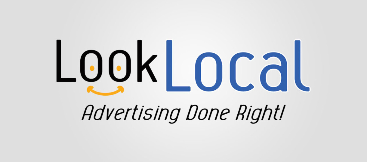
Will our new logo result in millions of dollars in revenue, will it eliminate all of our worries, will it change our lives? Maybe it will, I’ll keep you posted. But if nothing else, having a new sense of excitement, a fresh outlook, a feeling of pride when I hand over that business card, is all reason enough to validate the decision to change our logo and make me wish we had done it much sooner. Take a look; what do you think?

I would strongly encourage every business owner to take a step back from your day to day operations, look at your logo and/or marketing materials and ask yourself, “Do I LOVE this?” If you don’t, change it. Don’t wait until you are embarrassed or feel like you need to make excuses. Maybe it’s not necessary to overhaul your entire look, sometimes a few tweaks can do wonders.
Case in point: Twitter.
Take a look at the changes that Twitter made to their logo in 2012. Though, as far as I know, there was never a formal explanation as to why the changes were made, I would venture to guess they had these things in mind:
- The new design with one less wing feather, a feather-less head and crisper points is much more modern, simple and sophisticated – even for a cartoon bird.
- The alteration to the beak pointing upwards in the new design evokes a much more inviting vibe.

No matter how large the business, how small the changes or how long it’s been since a review has been done, every business should periodically review their logo.
BTW: The meeting where I decided I couldn’t stand our logo any longer did result in a happy new Look Local advertiser!
Author: Crystal Scribner